If my explanation is still confusing, the following link is a pretty good reference, though it refers to 500mB/hPa charts and airflow diverging at the top of a low pressure cell, neither of which I wasn't going to mention yet:
http://www.atmo.arizona.edu/students/courselinks/fall12/atmo336/lectures/sec1/p500mb.html
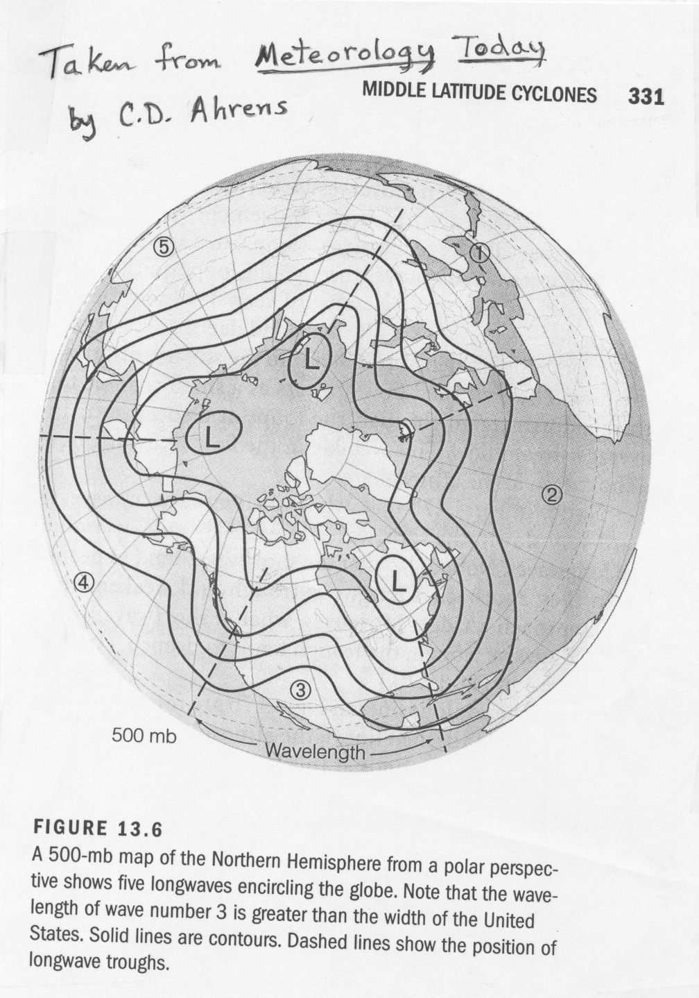
From that link, the following image is a simplified northern hemisphere chart derived from a model output, with the North Pole in the centre, as though you were directly hoving above it and viewing the northern hemisphere from that angle:
As the caption states, this is a Wave 5 pattern, with the ridges numbered.
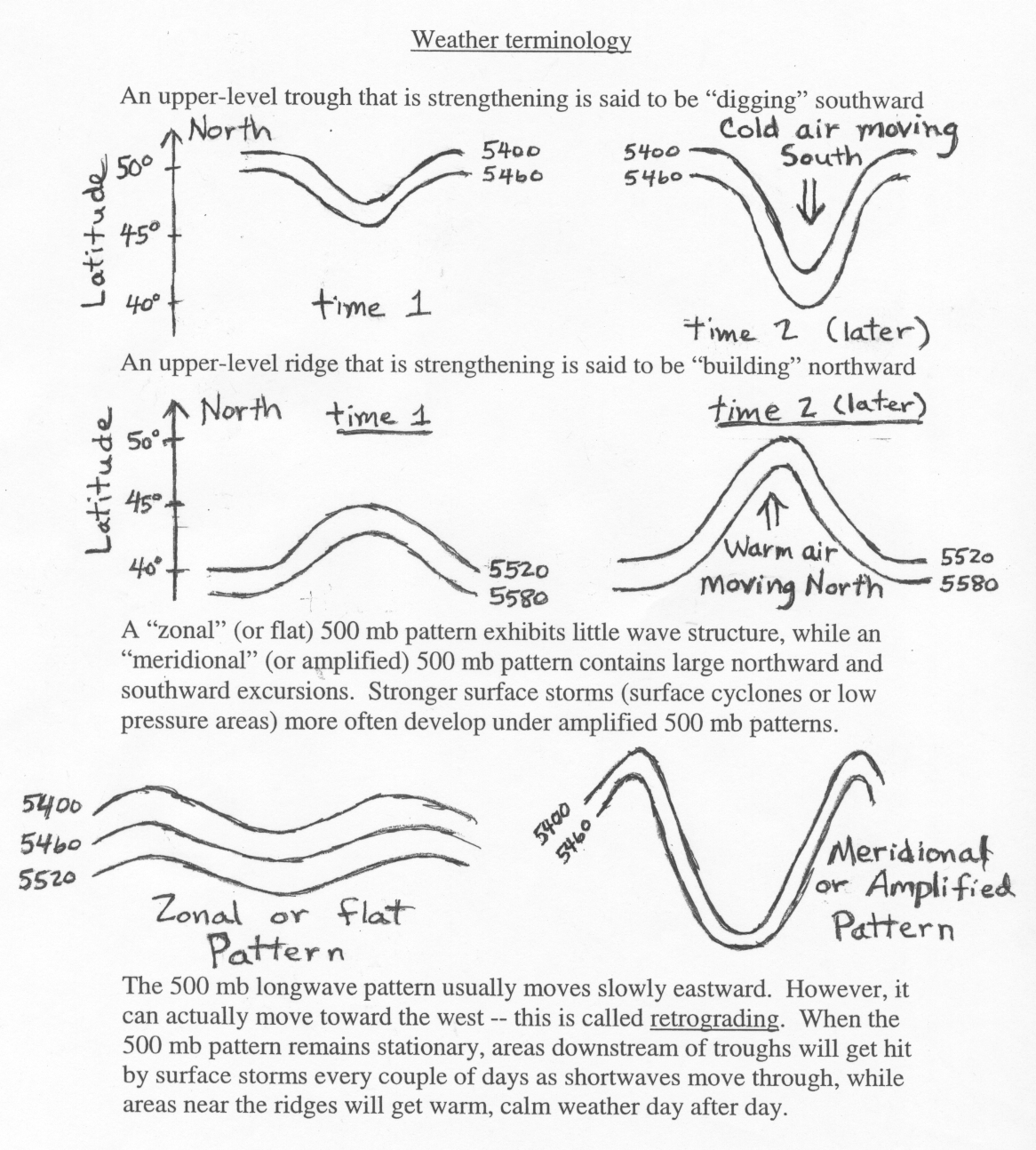
Below is another diagram from the same linked site, showing the difference between a zonal and meridional jet:

")